Hong Kong’s M+ Museum is carefully named: pay attention to the + sign. Beyond its remit as a museum of 20th- and 21st-century art, additional elements such as architecture and design, fashion, film, graphics and more make this a celebration of the recent visual culture of the immediate region and beyond.
At the heart of the museum, which opened in 2021, is an exceptional founding collection, consisting of more than 1,500 pieces of Chinese contemporary art donated by Swiss businessman and diplomat Uli Sigg. Too extensive to be on permanent display, the works in the Sigg collection are shown on a long rotation, changing every few years. This is very much in keeping with the museum’s style, revolving a range of temporary shows rather than being a traditional repository museum.
1) “1995.2” (1995) by Fang Lijun
However the Sigg collections are rotated and rehung, this masterpiece of Chinese art will surely be on view: recently it featured in Picasso for Asia, the museum’s show of Picasso related to Asian artists. It’s a perennially fascinating and mysterious painting: created at a moment of deep change in China, its quasi-surreal atmosphere, with the mighty central figure seen only from behind, evokes an unnamed individual versus an equally anonymous society, or perhaps the looming present confronting the recent past.
2) “Bloodline — Big Family No. 17” (1998) by Zhang Xiaogang
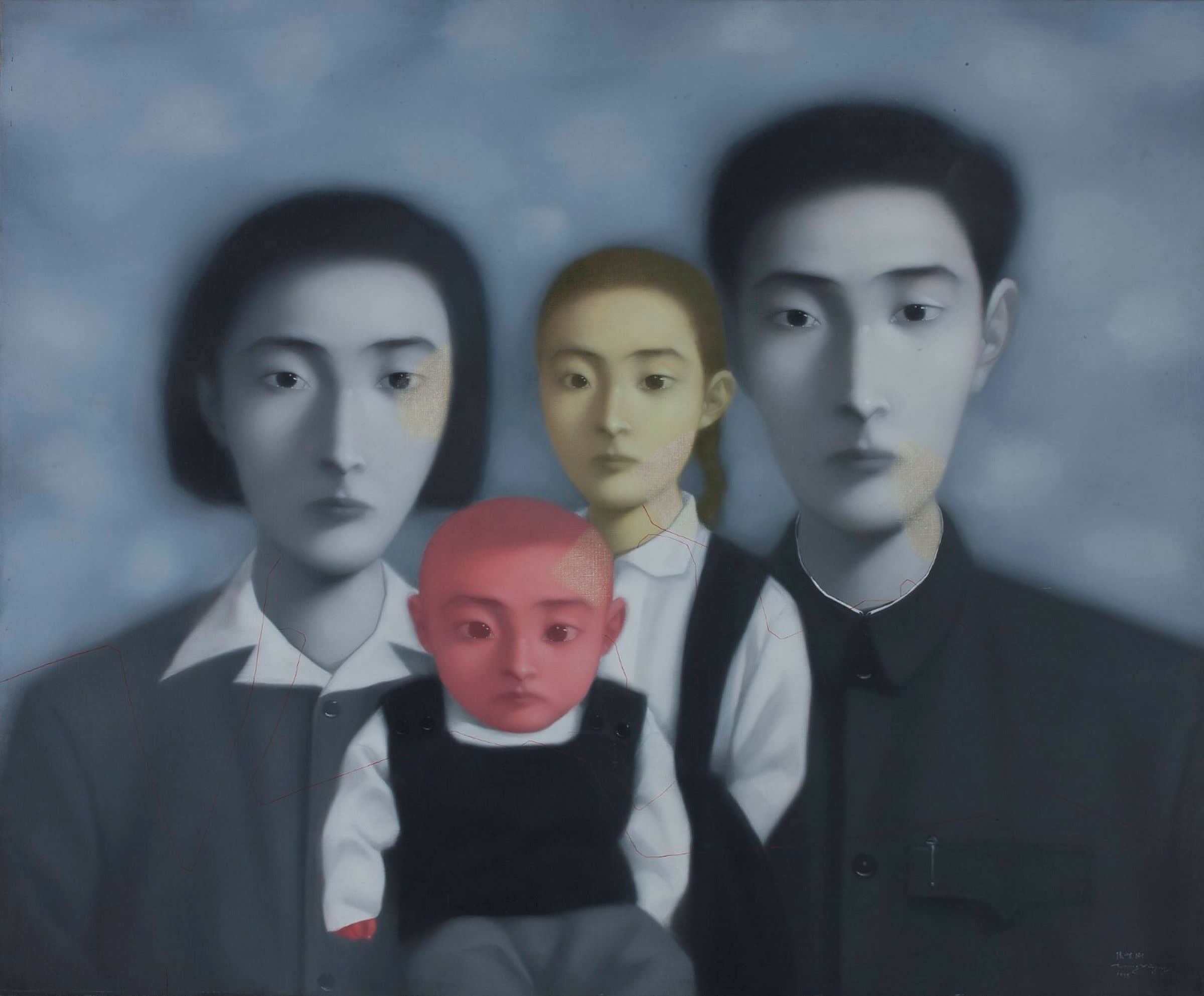
Another masterpiece from the Sigg collection, and another picture defining its era, bearing a similarly haunting sense of mystery, open to multiple interpretations. Although it was painted in 1998, the family’s clothes evoke the fierce conformities of China in the 1950s and 1960s, and their blank expressions imply a shutting-off of individual personality. The parents are in greyscale, as if fading slowly into a sepia past (Zhang Xiaogang’s “Bloodline” series was inspired by old family photographs) — the young children, though, are strangely tinted in a sickly pale pink and green as if they could be growing into a world of colour.
3) “Family Tree” (2000) by Zhang Huan

A third choice from the riches of this collection is also, according to its title, based on family, but this time it’s as full-on and confronting as the previous work is gentle and allusive. Zhang Huan began as a performance artist and these nine photographic panels document a live performance in 2000 in New York. The artist’s face is gradually covered in calligraphy, the texts reflecting on personal stories that explore the faltering Chinese identity of an artist in exile. By the final photograph his stern, immobile face is completely obscured by the black ink, with an emotional impact that is strangely confusing and strangely exhilarating.
4) “Hundred Layers of Ink — Chine demain pour hier” (1989) by Yang Jeichang
This majestic work is a famous piece in recent Chinese art history. In 1989 Yang Jeichang was invited to take part in the now legendary Paris exhibition, Magiciens de la terre, which introduced around 100 exciting new artists from all over the world to a western public, often for the first time. Yang’s work for the show was stopped by Chinese customs, however, and he had to rapidly come up with alternative pieces using only materials to hand. The result was the start of a series of monumental works, layer upon layer of black ink and alum brushed on to traditional Xuan paper until the densely textured surface seems almost to be moving and squirming, liquid and shimmering. This piece was not displayed within the safe white walls of the Pompidou Centre but in a ruined abbey, like a sort of anti-altar, its ink mixed with soil and bone-dust from the graveyard — a deep cry of nihilism created at exactly the moment when, back at home, the artist’s friends were facing the tanks in Tiananmen Square.
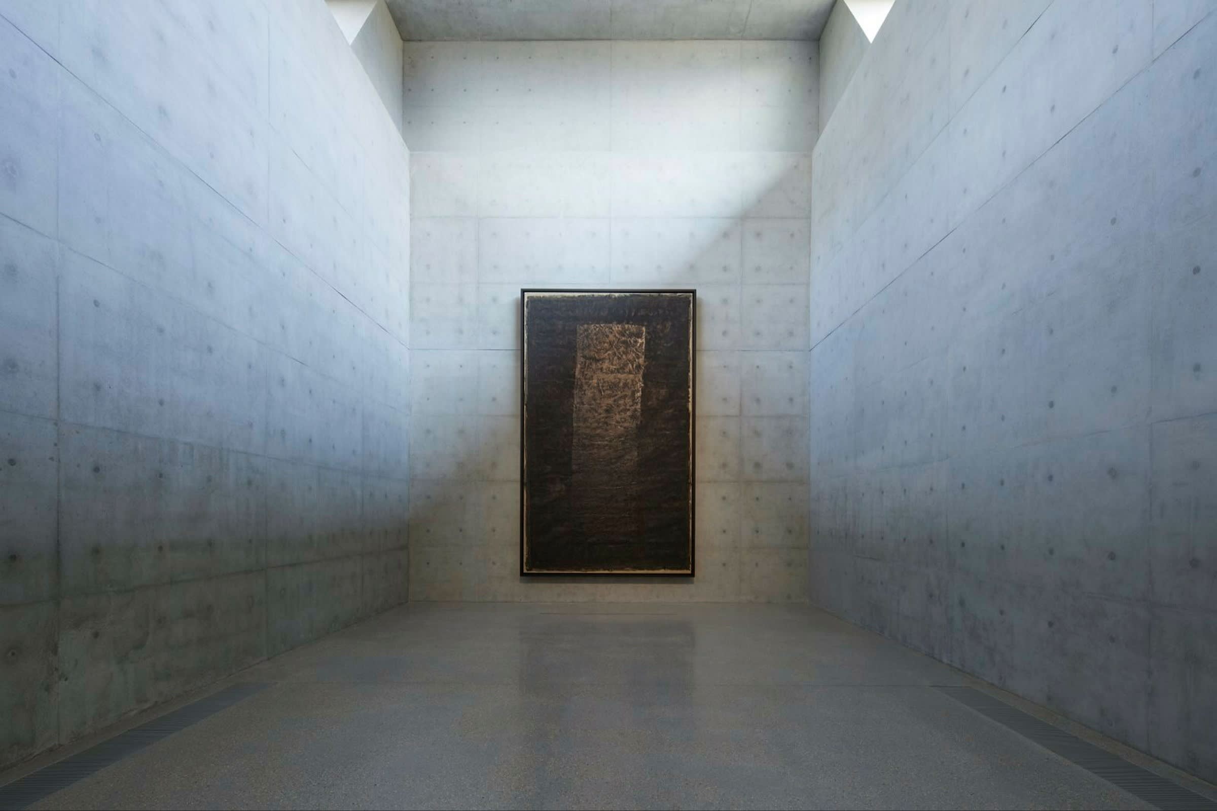
5) “Sky-Land Expression #15” (2003) by Wucius Wong

“Landscape” is the usual translation of the Chinese word shanshui, but it’s a poor equivalent for a concept that goes far beyond a school of painting, resonant with notions of time, history and mortality, encompassing centuries of Chinese philosophical thinking and a complex set of metaphors for the relationship of human beings to our natural surroundings.
M+’s revolving section Shanshui: Echoes and Signals shows how these ancient traditions are explored by today’s artists, and how the ancient craft of ink is translated into media that include sound, architecture, moving image, even LED installations. Hong Kong-based Wucius Wong, now 89, is known as the leading proponent of the New Ink movement, using traditional materials (this is ink and colour on silk) to make abstracted landscape works of amazing power and beauty.
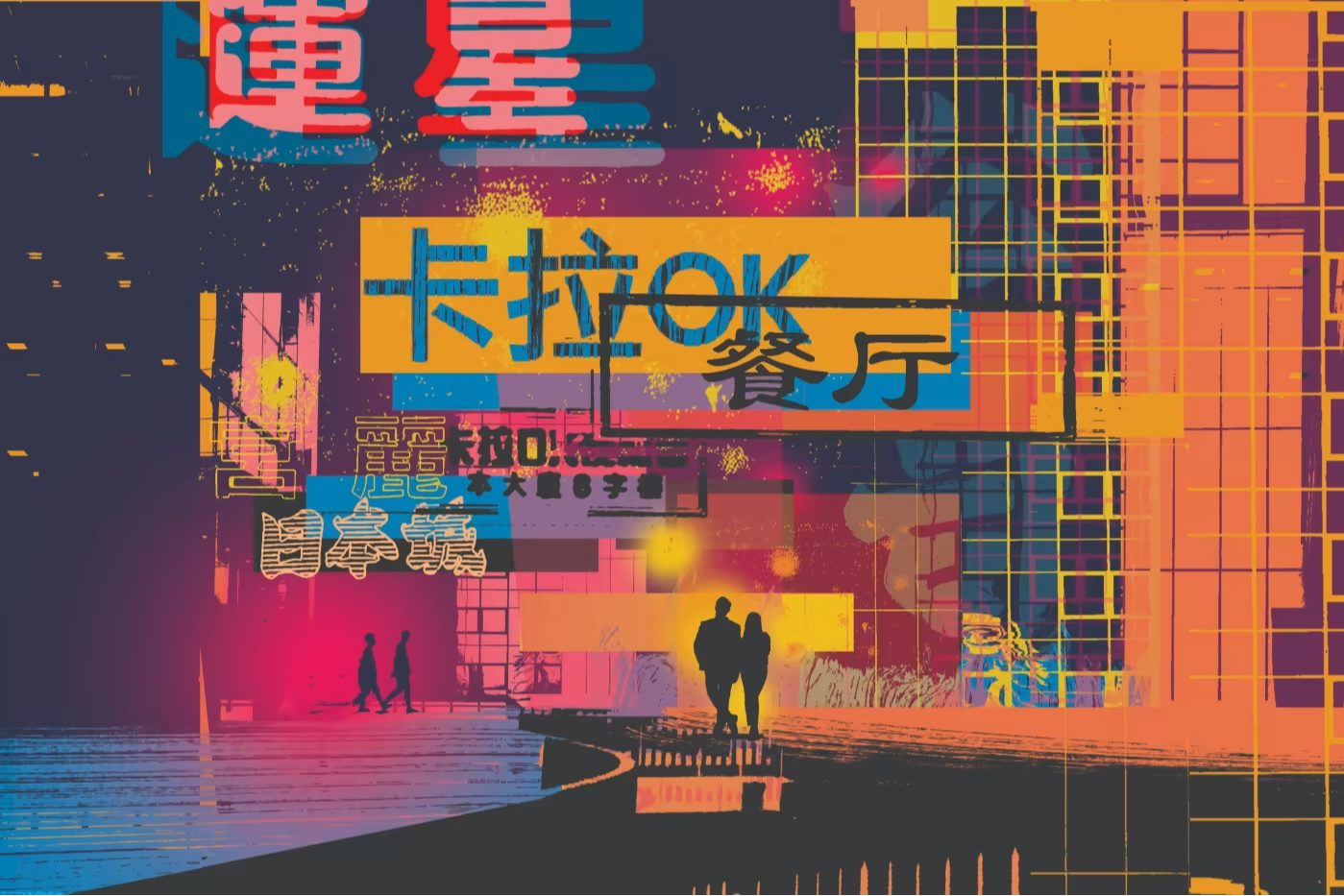
6) Neons


A true piece of Hong Kong history. From the 1920s, the city’s narrow streets were festooned with a jungle of garish neon signs advertising everything from restaurants to barber’s shops. As they gradually fell into disrepair they were replaced by more sober and conventional signs, but their glorious inventiveness and quirkiness makes them superb design objects in their own right — objects that M+ is working to preserve. The museum’s capacious restoration workshops are not open to the public but there’s a large viewing window at ground level to display work in progress. You can get close-up to two enormous neons — one a set of Chinese characters and a cockerel advertising a mahjong parlour, the other a giant cow (about twice life size) signalling a steak restaurant — testaments to the disappearing character of the city.
7) Capsule from the Nakagin Capsule Tower in Tokyo (1970-72)

The museum’s architecture and design galleries include a complete individual living pod from this fascinating 1970s architectural and social experiment, the brainchild of designer Kisho Kurokawa. In the heart of Tokyo, a tower composed of individual units slotted into place provided tiny capsules, measuring just 2.5m × 2.5m × 4m, for busy execs or exhausted commuters to sleep and shower before the next day’s exertions — just enough room for a sleeping platform and a tiny bathroom, with a large circular window at one end that evokes an early space capsule. All the technology of the day was included: Bakelite telephone with a dial and a clunky little television. The idea didn’t really catch on, though (why not?), and the tower was finally demolished in 2022.
8) Kiyotomo sushi bar (1988)
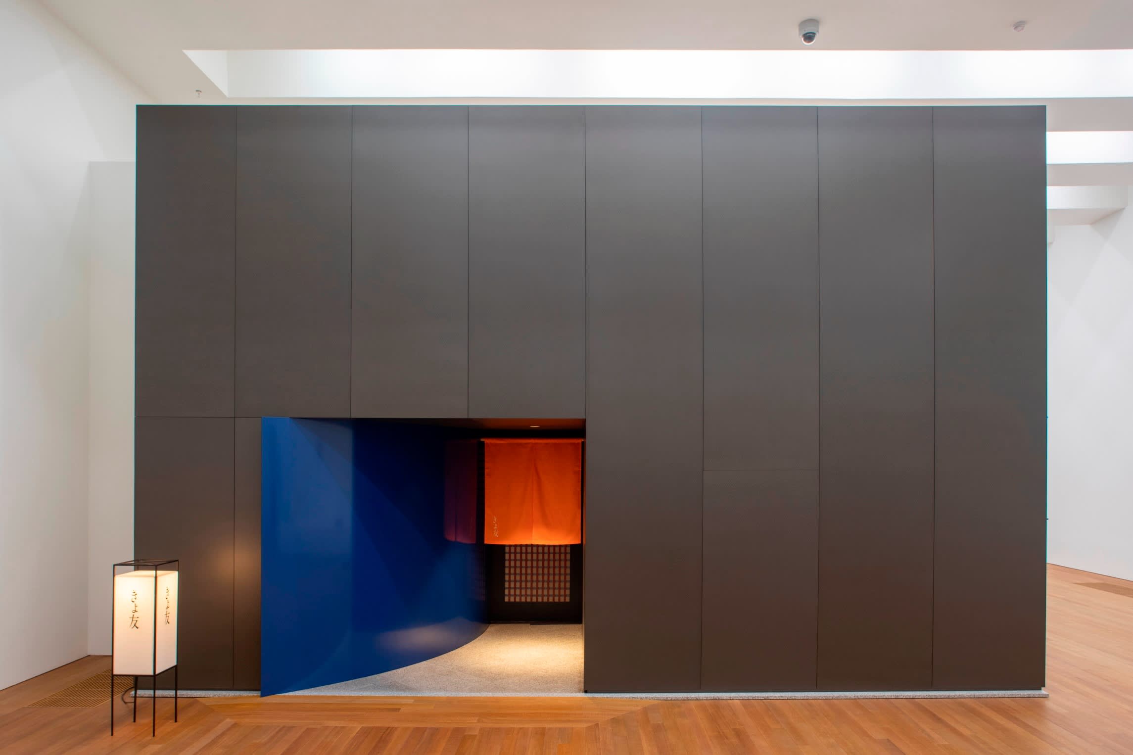
Another piece of superb Japanese design from Tokyo’s 1980s boom years, this time by Japanese furniture and interior designer Shiro Kuramata: a complete, tiny sushi bar, hardly bigger than a large domestic kitchen. Its sleek granite slab of bar with high stools, modernist Ingo Maurer glass lighting suspended on thin steel wires, miniature glass-topped circular tables and other details show how the Japanese aesthetic of the 1980s and 1990s has become deeply ingrained in our own everyday design language.
9) Peacock Chair made for the Imperial Hotel Tokyo by Frank Lloyd Wright (c.1921)

Among a plethora of fascinating exhibits in the M+ design galleries — from the three-wheeled “Midget” model MP5 truck (or “tuk tuk”) first produced in Japan in 1957 to an early Kikkoman soy sauce bottle or propaganda posters for rural health campaigns — there’s a reminder of the region’s sophisticated luxury hotel sector: an asymmetrical early modernist chair from the early 1920s, made of oak, oil cloth and metal, created by one of the greatest American architects.
10) M+ facade projections
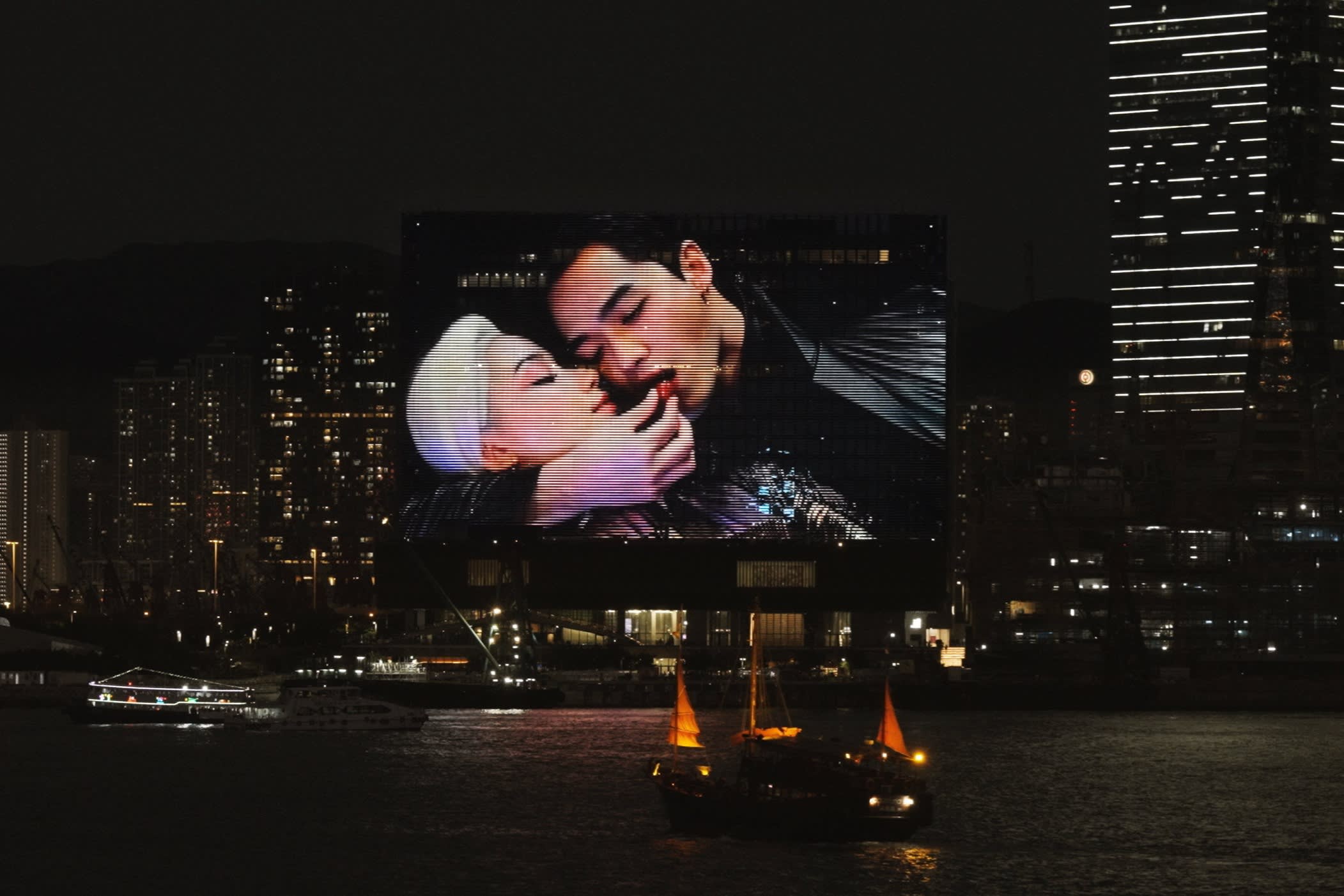
Across the front of its mighty waterside building, M+ runs a series of LED screen images that light up the night sky, clearly visible from the main part of the city across the harbour. Far beyond the usual smudgy son et lumière these are real works of art — most of them specially commissioned — and have a stunning clarity, announcing the museum’s powerful presence. Perhaps, too, a nod to Hong Kong’s neon tradition of the last century.
Cities with the FT
FT Globetrotter, our insider guides to some of the world’s greatest cities, offers expert advice on eating and drinking, exercise, art and culture — and much more
Find us in Hong Kong, Tokyo, New York, London, Paris, Rome, Frankfurt, Singapore, Miami, Toronto, Madrid, Melbourne, Copenhagen, Zürich, Vancouver, Edinburgh, Venice and Lagos
What’s your favourite piece of art in M+ Museum, and what other Asian galleries would you recommend? Tell us in the comments below. And follow FT Globetrotter on Instagram to find out about our latest stories first