Stay informed with free updates
Simply sign up to the Visual and data journalism myFT Digest — delivered directly to your inbox.
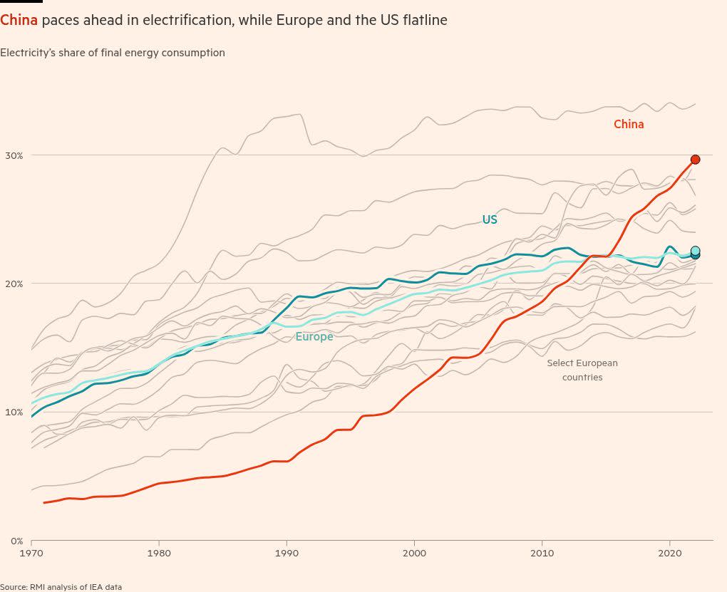
China could be on its way to becoming the world’s first major “electrostate”, with its electrification rate climbing to 30 per cent, ahead of the EU and US where electricity as a final share of energy has plateaued around 22 per cent in recent years.
Petrostate is a term that will be very familiar to most people — but electrostate maybe less so.
Electrification is the process of swapping processes and technologies reliant on fossil fuels with electrically-powered alternatives. Examples include switching from petrol to electric vehicles, installing heat pumps instead of gas boilers and replacing coal-powered blast furnaces in steelmaking.
Why does it matter? In short: to put a lid on the greenhouse gases which are the main cause of global warming, start by electrifying everything.
Electrification is “one of the most important strategies for reducing carbon emissions from energy”, according to the International Energy Agency.
How we made it
To chart overall electrification we turned to the RMI experts who had used IEA country-level data to calculate electrification rates, helpfully updating their figures with the latest data.
Nerd note on the metrics: Electrification as the share of electricity in final energy consumption shows how much of the energy actually used comes from electricity (vs from fossil fuels). It is direct indicator of a system’s electrification, and what we used throughout.
A different metric is the share of electricity in primary energy consumption, taking a supply-side view. This shows use of raw energy sources, so only “primary” electricity such as wind, solar and hydro are accounted for in the electricity portion.
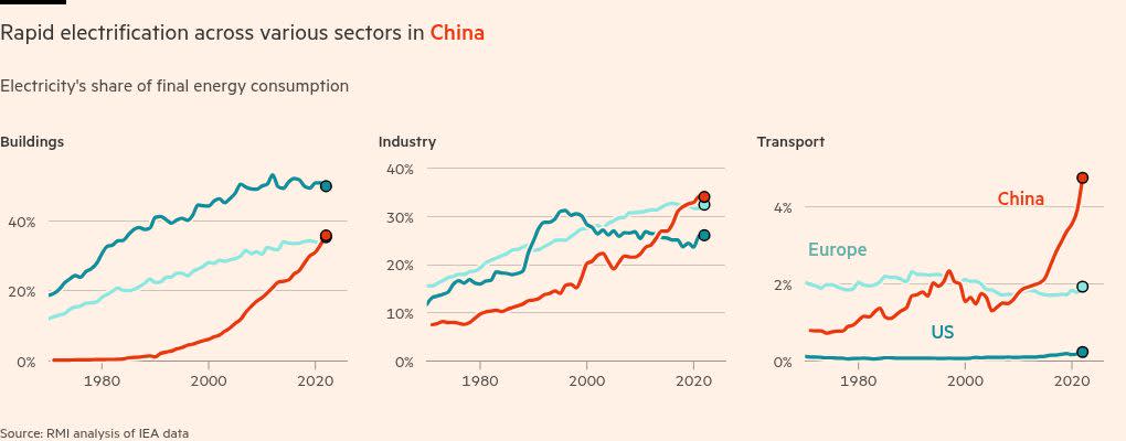
Small-multiple charts allowed us to also show sector-level trends. While China has yet to overtake the US in the electrification of buildings, and only recently caught up to the US and Europe in industrial electrification, it has rapidly surged past both in transport.

Electric vehicles are of course a key driver at home and abroad. Rho Motion, a market insights company focused on EVs and batteries, shared their data on the size of various EV markets as well as the segment held by Chinese companies.
To show both metrics at relative scale, we decided to visualise this data in a proportional area chart — the large square representing the total number of battery electric and plug-in hybrid electric vehicles sold in that country in 2024, and the red square within showing the Chinese share.
The high proportion of vehicles coming from China, particularly in south-east Asian, Central and South American countries, is immediately obvious.
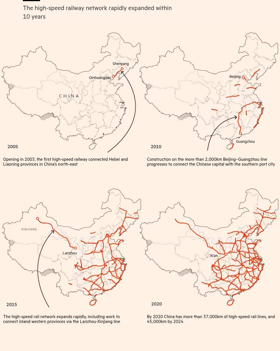
The path to electrification has also been supercharged by the rapid expansion of the country’s modern rail network. The network of high-speed rail spans 45,000km — five times the size of the EU’s — and is forecast to expand to about 60,000km by 2030.
We pulled geospatial data from the GIS Database for China’s Surface Transport Network, which includes yearly snapshots of the country’s rail, water and motor ways. To show the rapid build-out of high-speed rail, we mapped the data at five-year intervals. [Nerd note: this was done in Qgis by importing the yearly shapefiles].
Initially we had considered animating the data, but once we saw how evident the boom was even via static maps we decided against it for simplicity’s sake. The increase between 2010 and 2020 is astonishing.

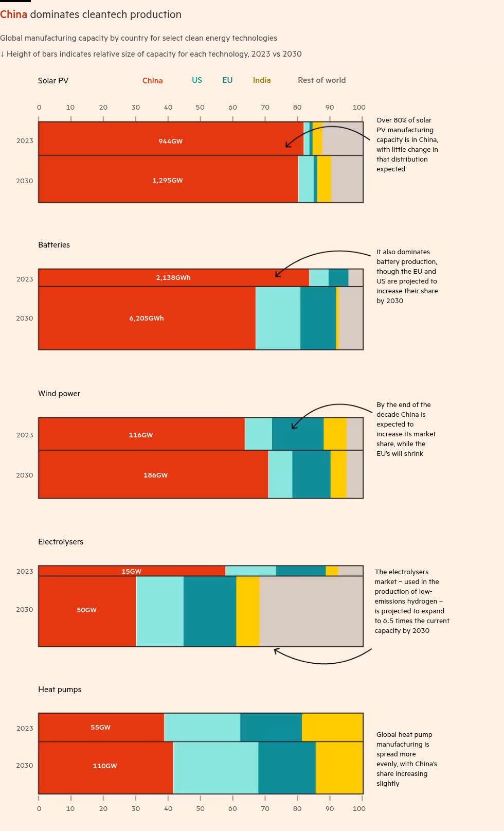
To show the power capacity additions we referred to a number of sources: for solar, wind and hydro the annual capacity additions were compiled by the Centre for Research on Energy and Clean Air from China Electricity Council data, while the coal stats came from Global Energy Monitor’s coal plant tracker.
China’s electricity mix also includes nuclear, gas and bioenergy — however coal, solar, wind and hydro make up more than 90% of the country’s total installed capacity and the vast majority of its planned additions, so we focused on those four.
A key question from some readers was “What about nuclear?” We debated including nuclear in the maps or the capacity additions charts but given how much lower it was — and barely visible — it made more sense to exclude it. Instead we added a footnote to highlight the dominance of the rest.
The operating and planned power maps (go to the story to see these — we’ve run out of space here!) were created using Global Energy Monitor’s Integrated Power Tracker, which has a host of project-level information.
While Washington is pursuing a different approach under President Trump’s “drill baby drill” mantra, aimed at increasing the US’ record high oil and gas production, Beijing pushes ahead with its clean energy revolution.
Join us for the Climate & Impact Summit on 21—22 May, held in-person in London as well as online, bringing together business, finance, and policy leaders dedicated to progress towards the UN Sustainable Development Goals through collaboration, innovation and investment. As a valued subscriber enjoy a 10% discount on your pass here.
Climate Capital

Where climate change meets business, markets and politics. Explore the FT’s coverage here.
Are you curious about the FT’s environmental sustainability commitments? Find out more about our science-based targets here