Receive free US updates
We’ll send you a myFT Daily Digest email rounding up the latest US news every morning.
A good bag of entries for last week’s charts quiz, but a deliberate curveball with the final chart caught a lot of people out (sorry).
Here are the correct answers.
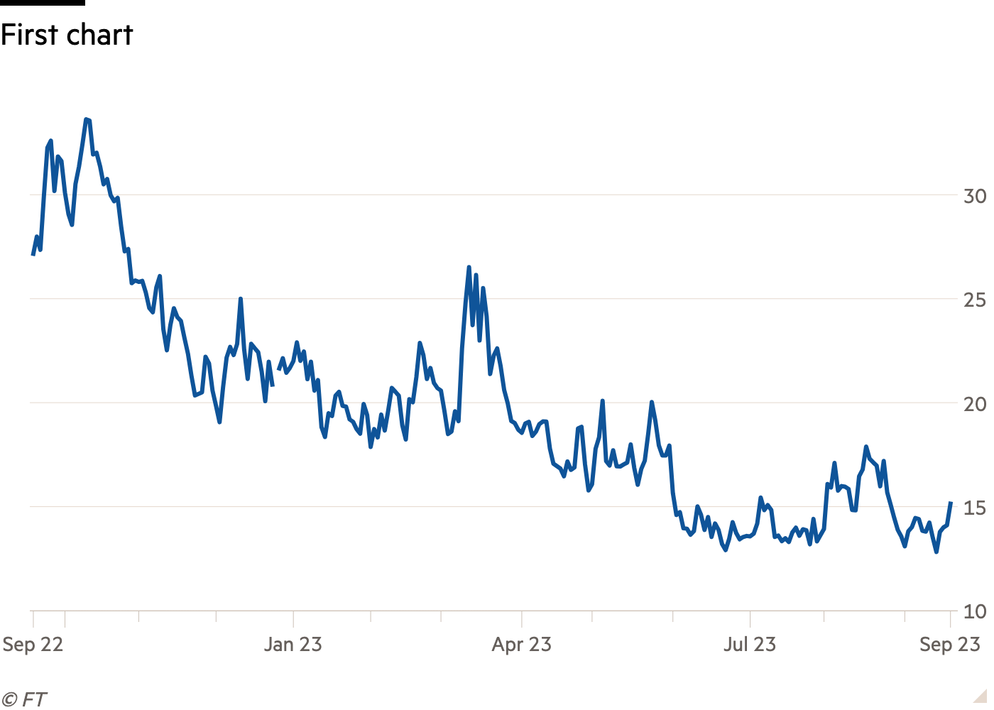
A lot of people correctly guessed that this shows the Vix index.
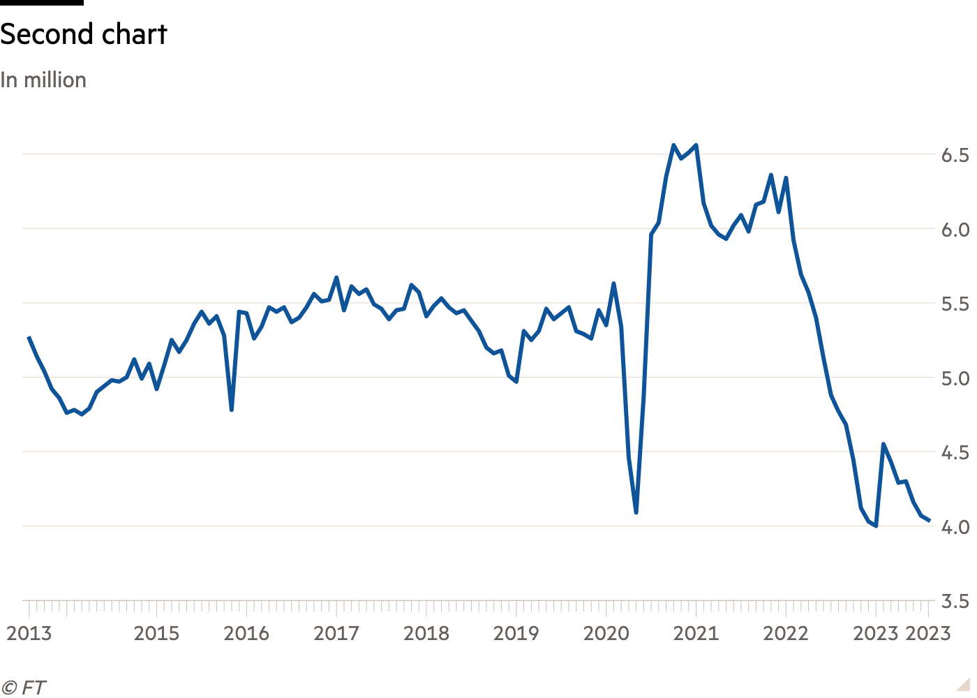
And even more managed to correctly guess that this is the (seasonally adjusted annual rate of) US existing home sales.
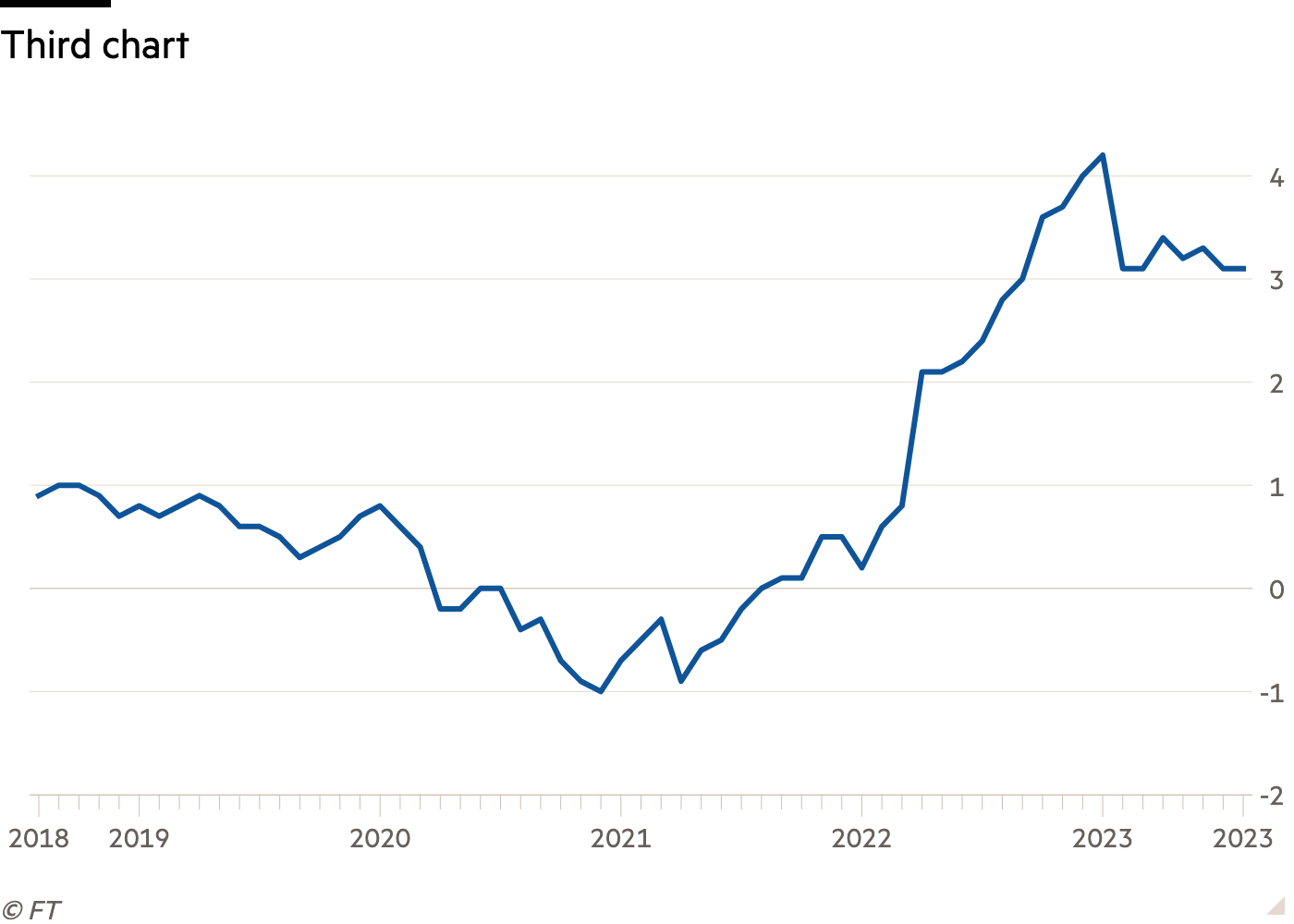
Quite a few people guessed that this one showed Japanese inflation. However, most people said it is the overall inflation rate (currently 3.2 per cent). This is actually Japan’s core inflation rate — excluding fresh foods, but not energy, weirdly — which is currently 3.1 per cent.
We’ll admit that seeing that from squinting at the chart is tricky, but the subtle clue was that it stayed the same from July to August. The headline inflation rate fell from 3.3 per cent in July. If it’s any consolation to the people wrongfooted by this one, former Alphavillain and general macro savant Matt Klein didn’t get it either.
But these people still nailed it: Sean McPherson, Fabien Bossy, James Memon, James Ritossa, Rory Boath, Oliver Knight and Valentin Giust.
And from our virtual hat/spinning wheel we got . . . Rory Boath. Congrats! The T-shirt will be on its way soon. Commiserations to the rest of you, but there will be a new quiz on Friday.